Thursday, October 17, 2013

Review and Swatches: Wet n Wild Walking on Eggshells

This Wet n Wild trio in 380B Walking on Eggshells ($2.99 at drugstores) has been my go to recently for an easy and pretty day look. This trio consists of a satin light cream with gold undertones, a satin medium brown with very warm, orangey-gold undertones, and a shimmery peachy-pink champagne.


Below are swatches with and without flash, swatched in the order of the shadows in the packaging.

Swatches with flash

Swatches without flash


You can probably see that the cream is not as opaque as the brown and champagne. You can use it as a nice sheer highlight, or build it up or use it over a base if you want more opaque color.

The brown shade has fair color payoff with a nice texture- not too hard or soft, not too powdery or crumbly- but requires a little bit of building up if you want full coverage color. This color is great in the crease for a lighter look when you want something defined but not too smoky. It looks almost matte when blended out so the satin finish isn't a problem.

The champagne color is beautiful and insanely pigmented, which is in part due to a somewhat crumbly texture. It's easy to pick up too much, which can lead to fallout, but in my opinion the slight trouble is worth it for the gorgeous shimmery effect- I love the peachy undertones, which I find to be flattering on all eye colors and especially bring out green or blue eyes. It can also help cancel out any blue or purple hues in the inner corners and really wake up your eyes!

In terms of longevity, at first I experienced a little creasing with the champagne shade if I packed it on too much, but now that I've got the hang of it I haven't had any problems. With a primer, these shadows have lasted me about 14 hours. Without a primer, they start to fade around 7 or 8 hours but this fading is not noticeable from more than a foot away. Overall I'm very impressed with their performance.

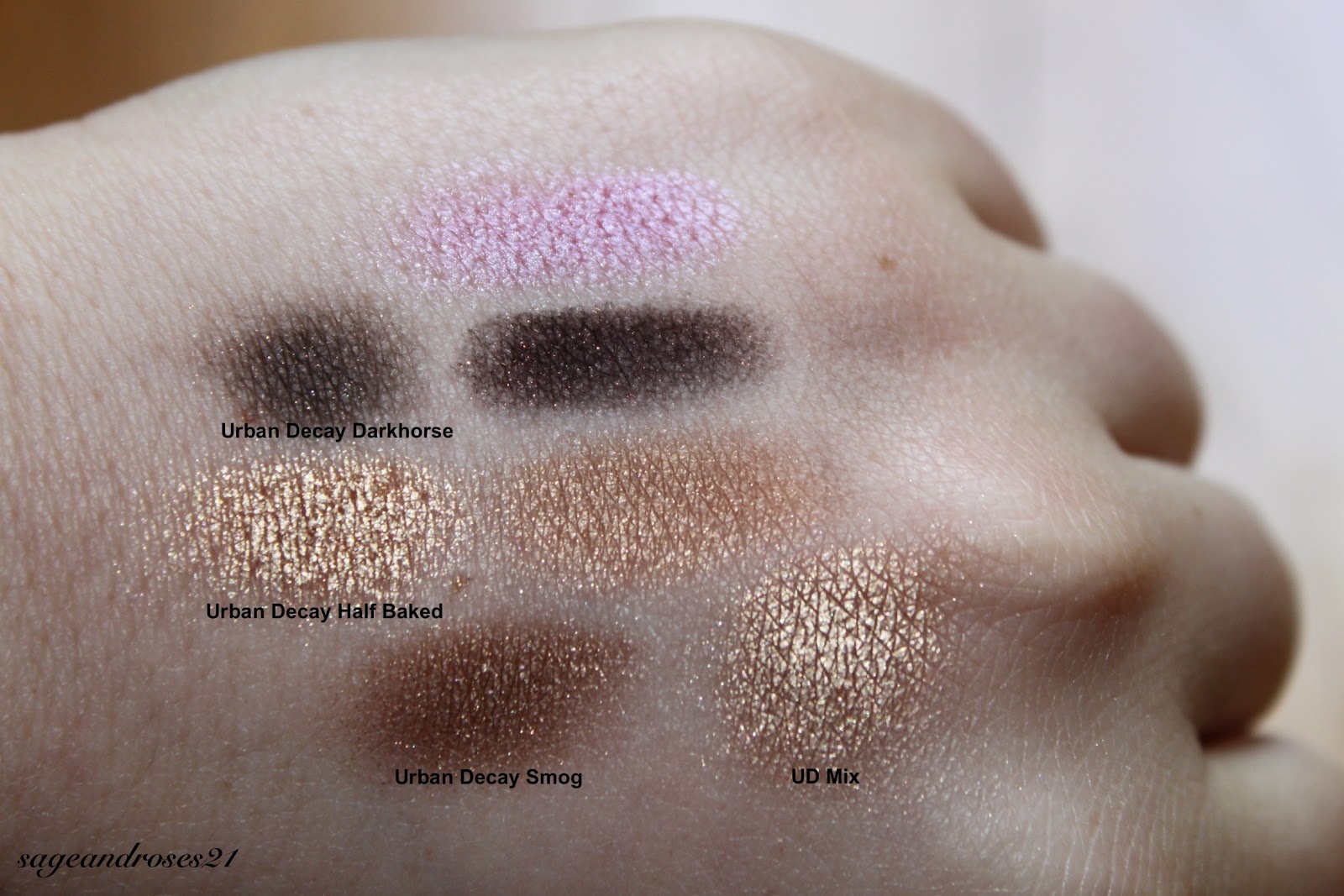
Now for dupes! This palette is well-known for containing three Mac dupes- Shroom, Cork, and Naked Lunch. I decided to look beyond these known dupes and look for some more. Here's what I found:


Comparison swatches with flash
Comparison swatches without flash


The closest dupe I found was Urban Decay Sin and the champagne "eyelid" shade. They are almost identical in color, with Sin looking a tiny bit darker in certain lights. Sin doesn't have the same crumbly-ness and is slightly less reflective on the eyes, but overall they are practically interchangeable.

For the medium brown shade, I found that it was close to Urban Decay's Buck, but Buck is completely matte, a little darker, and slightly less warm toned. They create the exact same effect on the eyes, though.

Finally, the cream shade was lighter than either Urban Decay Virgin or Urban Decay Bootycall, and had slight yellow undertones as opposed to the peachy undertones of Bootycall and cool pink undertones of Virgin. Bootycall is closer in color but Virgin creates a more similar effect on the eyes, with a slightly shimmery satin finish.

Overall, this is a great drugstore product with great pigmentation, workable textures, and good blendability. While these certainly aren't the most unique colors out there, this is a great staple in anyone's collection, and as described above, each shade can be substituted for certain Mac and Urban Decay shades, which are many times more expensive. Considering the low price and relatively high quality, I would definitely recommend picking this up.

Pigmentation: 9/10 (I wish the cream shade was a little more opaque)
Texture: 9/10 (As mentioned above, the champagne shade can be crumbly if you're not careful)
Longevity: 10/10 (Comparable to any high-end eyeshadow; last all day with primer)
Price: 10/10 (Great value at only $2.99)

Overall: 9.5/10

Tuesday, October 15, 2013

Review and Swatches: Wet n Wild I'm Getting Sunburned

The 334 I'm Getting Sunburned trio from Wet n Wild ($2.99 at drugstores) immediately makes me think of summer, but you could definitely use it all year round. The trio consists of a gorgeous frosty blue-toned pink, a matte deep brown with red glitter, and a golden bronze shimmery shade.


Here are swatches without flash; it's slightly out of focus so you can see the glitter in the middle shade and the frosty finish of the top shade.


The pink shade is perfect. It is smooth and silky with excellent pigmentation and it just glides on. It's legitimately pink, as opposed to some shades such as Urban Decay Sin, which are pink-toned champagnes. This makes is unique and fun but a little more difficult to wear- it's less of a neutral, and can be used more as a pop of color. The frosty finish makes it really brighten up the eyes. If you are familiar with color theory for eye makeup, you know that you should wear the same color as your eyes or the opposite color on the color wheel to make your eyes pop, so I've found that this pink is great for green eyes, but I think this could be flattering on anyone. Personally, I would not use this as a browbone shade as the palette suggests (I would use it on my lid) but someone with darker skin might be able to pull that off.

The brown shade is also very pigmented, but is a little drier and can go on patchy if you don't blend it well. If you blend it too much, you can lose the glitter, which could be good or bad depending on how you look at it. The glitter doesn't detract from its function as a crease or definer shade. This is the exact same shade as the left definer shade in the Comfort Zone palette by Wet n Wild, but I think they reformulated it because that one is a little less dry and stains the skin slightly.

The golden bronze shade has the same silky texture as the pink but is not quite as pigmented. It still has good pigmentation and just crosses the line between satin and shimmer. I wanted to see how this color compared to Half Baked by Urban Decay, so I pulled out my Naked palette and made some comparisons.

Comparison swatches with flash

Comparison swatches without flash


I compared the dark brown to Darkhorse by Urban Decay and found that Darkhorse was a bit lighter and had gold glitter rather than red glitter, but blended out I think the Wet n Wild shade could create the same effect on the eyes.

As you can see, Half Baked is lighter and more of a true yellow gold compared the orange undertones of the WNW shade. Half Baked also has that famous ultra-metallic finish. Urban Decay Smog has a more similar finish and undertones, but is a couple of shades too dark. I found that if you blend two parts Half Baked with one part Smog, you can create a shade that is identical to the WNW color in some lights, but at other angles the metallic finish of Half Baked comes out too much.

While the WNW palette doesn't have any exact dupes that I could find, it does allow you to create a somewhat similar look to the Naked palette that would be great for a summery, bronzy smoky eye.

In terms of longevity, I found that these shadows were the perfect mix of silky and slightly dry so that they avoided the creasing seen with overly "creamy" powder eyeshadows, while escaping the fading that can be caused by shadows that are too dry, even without primer.

With a variety of finishes, a couple of near-dupes for Urban Decay classics, and a lovely unique frosty pink, I definitely recommend picking up this trio for summer and transitioning into fall!

Pigmentation: 9/10 (The pink is great, the brown can be a little patchy, and the golden-bronze is fine but I wish it were just a little more pigmented)
Texture: 9/10 (The pink and gold are lovely, the brown is a little dry)
Longevity: 10/10 (Fantastic even without primer)
Price: 10/10 (For $2.99, this is a great deal- you get three nice, usable colors, two of which are near-dupes for Urban Decay shadows)

Overall: 9.5/10

Monday, May 20, 2013

Review and Swatches: Wet n Wild Blue Had Me At Hello

Wet n Wild's 8-color palette in 737 Blue Had Me At Hello reminds me of mermaids in the best possible way. It contains a slightly shimmery white, satin silvery baby blue, matte blackened navy packed with dark blue glitter, deep matte black, shimmery robin's egg blue, turquoise shimmer, royal blue satin, and black with medium sized silver glitter.


Below are swatches, with and without flash.

Swatches with flash

Swatches without flash


The white shade is somewhat sheer with a slightly dry texture. Ok for highlighting the inner corner but not something I reach for unless I already have this palette out.

The color below it is a very cool toned, almost silver blue that also has sub-par pigmentation, although the texture is nice and smooth. I find this color difficult to wear because it's so cool toned, so I rarely use it.

The next color is very interesting and unique in my experience- it has a very blackened, almost black navy base with blue glitter. Lovely for a unique smoky look. Beautiful when the glitter catches the light.

Last in this column is a standard matte black (it looks like it has some glitter in the upper picture but that's just from a not-quite-clean swatching finger.

The top shade in the right column is also not too pigmented but has a nice silky texture. It's not quite as cool toned as the second color in the left column, and is a bit easier to wear, though I wouldn't use it on the browbone. Maybe on the inner corner, and certainly on the inner half of the lid for a nice pop of color.

Speaking of pops of color, the turquoise is perfect for that purpose. It has a lovely smooth texture and great pigmentation. It can be a bit much all over the lid, so I stick to using it on the inner half, in the crease with a matte cream on the lid for a cool summery look, or, my favorite, running it all the way under the lower lashline for a daring bright daytime look (using nude liner underneath makes the color pop and last all day). I also like using it to set a nude or blue liner on the lower waterline for a more nighttime look.

The next color has nice pigmentation and texture and changes a bit depending on the angle, but isn't quite a duochrome- more of a dimensional shimmer. It can look navy, cobalt, or royal blue and is quite pretty but can be difficult to use because it's a bit dark for the lid and loses some of its beauty when blended into the crease. A nice compromise is using it on the outer half of the lid or under the lower lashline.

The last color is a deep matte black (even darker than the one on the left) with silver glitter. You can get rid of the glitter if you blend it out, but then you also lose a bit of the intensity. It's kind of a shame that the glittery black has a deeper base than the matte one, but the glitter isn't super noticeable, although it's larger than most of the glitters used in Wet n Wild eyeshadows. It can add a nice bit of dimension.

All of the colors fade a bit if not used over a primer or base, but I haven't had any issues with creasing.


The matte black isn't quite as intense as Urban Decay Blackout, and is slightly more blue-toned, but it's a nice dupe, especially for the price.

I think it would be worth it to buy the palette for the black alone, seeing as it's more intense than Mac Carbon and almost as dark as UD Blackout, for just $4.99, and you also get 7 other shadows. The white and two light blues have some pigmentation issues, but are fine over a base, and the turquoise is one of my all time favorite shadows. I love using the turquoise and dark blue to create fun looks in the summer, and the blackened navy and black with glitter create smoky looks with a fun twist. For someone who wants to step away from neutrals and try something fun and new, I would recommend this palette.

Pigmentation: 8/10 (Not impressed with the white and light blues but the great payoff of the turquoise and blacks makes it worth it)
Texture: 8/10 (The blacks, blackened navy, and white are just a little dry while the other four have an amazing silky texture)
Longevity: 8/10 (Not great without primer, but perfect with primer and absolutely no creasing)
Price: 10/10 ($4.99 is a great value for a standard black and some fun shades)

Overall: 8.5/10

Sunday, July 29, 2012

Top 3 Workwear Tips

It can be hard to express yourself and feel fashionable while staying within your employer's dress code, especially when it's as restrictive and casual as mine- jeans and sneakers required. But hopefully these tips will help you out. No heels? No skirts? No problem!

1. Work within the guidelines. Remember how I mentioned sneakers are mandatory here? Well, while everyone else is running around in tennis shoes, I prefer to interpret the rules in my own way.
My favorite Rocketdog "sneakers"
Sinfully comfortable, thankfully free of that squeaking noise sneakers can make against a linoleum floor, and far more expressive of my personal style than exercise sneakers. I'm so obsessed with these that I even got my gym teacher to accept them as sneakers, and I wear them so often that they are literally falling apart- the canvas is worn thin, the edges are fraying, and the red thread at the toe has unraveled. This beat up effect, along with the model of the shoe, adds a rocker/grunge vibe to any outfit. My style changes from preppy to boho to edgy depending on the day, so having these shoes is great for instantly changing the feel of an outfit while sticking to my dress code!

2. Use colors, cuts, and textures to your advantage. Although I love jeans, somehow being told I can't wear any other pants makes me resent them a bit. When I really think about it, though, the category of jeans is so expansive, I know I can't get bored! Especially with the trends this summer, it's so easy to incorporate jeans into your wardrobe. For a girly, flirty look try floral jeans, which have been everywhere this season!
Try these adorable jeans from Wet Seal!
Not into patterns? Bright solids are also huge right now.
These awesome jeggings from Delia's come in a bunch of pretty shades!
3. Use makeup to express yourself! First check what other people are wearing- if absolutely no one else puts on any makeup, you might feel awkward. But otherwise, it's a great outlet! Try a bold winged or cat-eye liner for an edgy look.


For a flirtier vibe, go with a fun lip color- as I said above with the jeggings, brights are all the rage this summer!
This bright pink is super daring and sure to make you stand out!
Hope these tips help you keep sight of your style within the restrictions placed upon you at work, and have a great rest of the summer! Back-to-school posts will be coming your way soon :)

Friday, July 13, 2012

Kiehl's Lip Balm #1 Review

As mentioned in the name of the product, this Lip Balm is #1, at least in my opinion. Silky smooth, long lasting, incredibly moisturizing, reasonably priced and with AMAZING scents, these are my favorite lip balms of all time.

The only downside is that the applicator doesn't have a slanted surface, so it can't be applied directly to the lips. However, since I primarily use this overnight, it's not a problem for me since I can just use my
fingers without worrying about cleanliness like I would if I were out and about.

So glossy and smooth!
Pictured are the lip balms in scents mango and cranberry, but they also come in mint, pear, vanilla, and coconut. I've tried and also loved the last two, but I prefer these two fruitier scents. They don't provide any color, but leave a beautiful sheen to your lips. As I said, I usually apply these at night and wake up with wonderfully smooth and supple lips. However, if you apply this during the day, in my experience it can stay on for 2 to 6 hours, depending on how much you eat, drink, and talk. SPF 4 won't do much, but it certainly doesn't hurt!

Cranberry- slight berry tint
Mango- slight coral tint
For $7, I would certainly recommend picking up at least one of these sweet-smelling miracle workers. You only need the tiniest bit, so one tube will give you at least a few months of gorgeous lips!

On a random note, if I have a really late night, I smooth a tiny bit of this on around my eye area and wake up completely bag-free! It really hydrates my skin and prevents the normal puffiness and darkness. However, as with any product not meant for application on the eyes, I'm always careful not to put it too close to my eyes- just on the skin around them. Also, I generally have dry skin, so if it's having an especially rough time, I rub a very (VERY) thin layer on my face and the next morning, my skin is glowing and looks practically airbrushed. Of course, Kiehl's has other amazing products for these purposes, but this is sort of an all-in-one product for me that can pretty much moisturize any part of my face in a pinch!

Sunday, July 8, 2012

Trend watch: Tangerine


Tangerine is a huge color right now (especially after tangerine tango was named Pantone's color of the year), but it can be hard to pair. Here are some questions to ask yourself so you can make it work with your style and skin tone.

Statement or subtle?
Are you trying to be bold with your color choice, or merely show your knowledge of color trends off in a simple outfit? If its the former, go all out and wear a cool pattern involving tangerine, or maybe a statement necklace. If it's the latter, go for a pretty lightweight blouse in tangerine, perfect for the warm summer months!
These cute floral shorts

This gorgeous J. Crew Bubble necklace

This polished but casual polka-dot blouse
Formal or casual?
Will you wear tangerine to a nice dinner out or to the beach with friends? If you need a more formal look, a darker color would be better, in a more polished fabric like silk or satin. Try a deep tangerine dress, or a sheer button down tucked into a white pencil skirt. Add some nude pumps and you'll be looking classic yet trendy! If you're going casual, opt for a softer fabric in a pastel or neon. Try a pretty pastel tangerine floaty dress as a coverup on a trip to the beach, or toss on some bright shorts to hang out at the mall with friends.
This gorgeous number from Free People for an evening party- also comes in mint, another trendy color this season!

This light piece for fun at the beach.
Pale or tan?
If you're pale, orange is probably already a hard color for you to wear. Stay away from pastel tangerine, as it will make you look washed out (pastel pink or lilac would be more flattering). However, a neon hue can actually make you look tanner, while a darker shade of tangerine will bring out your porcelain skin in a good way. If you have a deeper skin tone, it will be pretty easy to get away with this. If you get your tan from a bottle, though, you have to be especially careful not to use an orange-y spray tanner. Wearing a shade of orange with that will just bring it out! Pastel or a dark shade would look great and bring out your tan even more, while a more muted color will blend in and do little for your skin tone.

For pale skin, try this gorgeous neon orange in a classic cut
If you're tan, check out this pastel pinky-orange with cute neon detailing
A great option for pale OR tan skin is this deep tangerine- the red tone will work well with either skin type!
Once you've thought about your answers to these questions, you should be good to go. I hope this helps you pull off this gorgeous, fun color!

Wednesday, July 4, 2012

The Perfect Summer Shoe

Does anyone else go through that slightly manic phase the week before summer, trying to find a shoe that is absolutely perfect? I look for the three C's- comfy, cute, and cool. You'll probably be walking around town, so they can't be uncomfortable, they need to be wearable for nights out with friends or dates, and of course they have to let your feet breathe and not be stifling! With these three things in mind, I set out shopping and I think I found the perfect pair.

Rocketdog is one of my favorite brands for comfy/casual shoes, so I wasn't surprised to find this cute option in their section of DSW. The exact pair isn't available on their website, but they have a very similar style here, and another cute summery one here. White shoes are a classic for summer (SageTip- for a shoe this casual, don't be afraid of white- you can just toss it in the wash if it gets too dirty!) and this floral eyelet detail adds interest and trend points by tying into the huge lace trend this season. While not overpowering, the little flowers are so cute and keep this basic from crossing over into boring.

Great for wide and narrow feet alike, they mold to your feet and are sort of a mix between the shape of a ballet flat and loafer. I already picked up another pair in black, which should bring me comfortably into the fall!