Showing posts with label dupes. Show all posts

Monday, August 18, 2014

Review and Swatches: Wet n Wild Comfort Zone

738 Comfort Zone is a Wet n Wild 8 color palette ($4.99 at drugstores) that I find myself reaching for often since it contains a great mix of neutrals and greens. As someone with green eyes, it's a particular favorite, but I think it would really suit anyone. On the left, you have great neutrals including a satin gold-toned cream, shimmery peach, metallic bronze, and deep warm brown with red glitter. On the right are green shades, with a light olive-toned taupe shimmer, shimmery sage, blackened forest green with gold shimmer, and a red-brown/teal duochrome.


Below are photos in natural light showing the shadows from different angles, displaying the dimension in some of the shimmers and particularly the duochrome.


The cream is somewhat sheer and the gold tones come out more at certain angles. Although I would like a little more opacity, it's still a pretty highlight shade, especially over a light colored base, and it has a nice smooth texture.

The peach has beautiful pigmentation and finish and a smooth silky texture. This is one of my favorites in the palette for the high quality and the uniqueness of the shade. It has a nice contrast when used with some of the green shades on the right side of the palette, and I think it would look particularly great with blue eyes because of the orange tones.

The bronze also has lovely pigmentation, texture, and shimmer with a lot of dimension. It's not a particularly unique shade but it's very usable and would go with a lot of looks. While I like the peach for standing out against the greens, this one would blend in nicely and create a very cohesive look.

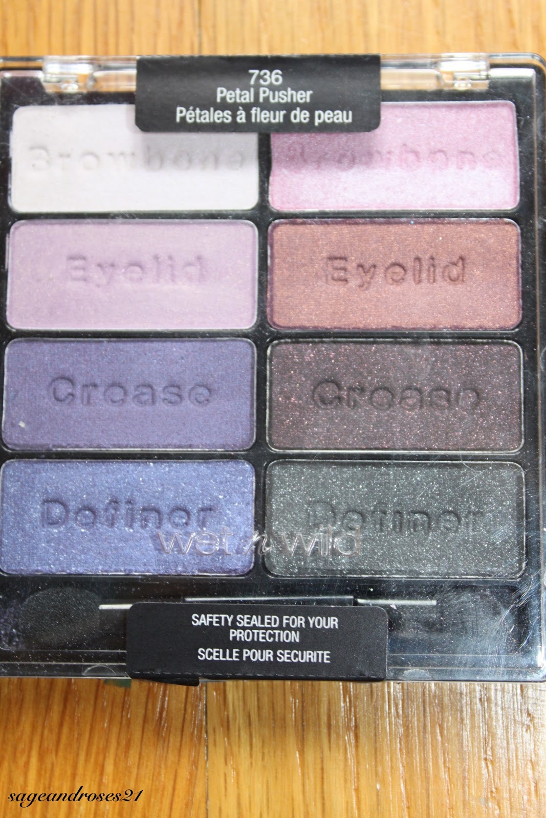
The brown is the same one as the crease shade in the Wet n Wild I'm Getting Sunburned palette, but I think it has been reformulated because this one is smoother but stains the skin. Other than the staining, it's very nice to define the eye or use in the crease for a smoky look. It's slightly warm toned but not too much so it could be used with pretty much any color family. The red glitter is not too apparent on the eye, but adds a nice unique aspect.

The taupe has a very dimensional satin/shimmer finish that makes it look light a light champagne at certain angles, whereas from other angles it looks darker and more true to pan. I find that it tends to look darker on the eye. This is a little sheer, but easily buildable and has a nice silky texture.

The sage green is smooth and has great pigmentation. It can be slapped on for a bolder, colorful look, or blended out for a more subtle effect. This color really brings out green eyes.

The dark green can be a little patchy but overall has nice pigmentation. I find that the glitter can disappear if you blend it out too much. I like to add this shade just in the outer half of the crease when I'm using the sage green on the lid so that it's not overwhelming. I'll use the bronze in the crease, or a matte brown if I don't want too much shimmer.

The duochrome is really lovely, with a fantastic silky texture and great pigmentation. I've found that if you don't put it on in one swipe, the duochrome finish can get messed up, but it works great if you put it just in the outer corners or sweep it lightly over the lid for a cool effect when you blink. My favorite way to use it is to swipe it just under the outer half of the lower lashline- it creates a really striking effect that can add interest to a dramatic look or spice up some otherwise neutral eye makeup.

I haven't experience any major problems in terms of longevity or creasing, though the cream shade can fade after about 6 hours if not used over a primer or base. The sage and forest greens can also fade a bit after 8 hours without primer.

Dupe alert! The duochrome is an exact color match for Mac club, and I'd actually say that the texture and pigmentation of this shadow are better. This is pretty well known, so I wanted to see if there are any other dupes in this palette, and I found one!


The bronze shade is an exact color and finish match for Urban Decay Smog, though I have to say I prefer the texture of Smog, which is just a little smoother. They look exactly the same though!

Overall, this palette has some great neutrals, a couple of really unique colors (namely the peach and sage), and two dupes for higher end shadows. I would definitely recommend picking this up since it allows you to create an endless array of neutral looks, and it gives you the opportunity to work in some color.

Pigmentation: 10/10 (The cream could be a little more opaque, but overall I'm extremely impressed)
Texture: 10/10 (The dark green is a little dry but most of them are silky and lovely to work with)
Longevity: 9/10 (There was some fading when they were used without primer)
Price: 10/10 ($4.99 is an amazing value for 8 nice eyeshadows- I think it's worth it even if you only use the neutrals on the left)

Overall: 9.75/10

Monday, January 20, 2014

Review and Swatches: Wet n Wild Petal Pusher

While it has some gorgeous colors, Wet n Wild's 8 color palette in 736 Petal Pusher was a bit of a disappointment due to poor pigmentation. It contains a white that flashes pink/lavender/light blue at certain angles, a matte lilac with gold shimmer, a violet satin, a blue-violet with silver glitter, a light pink frost, a matte rust with rose gold glitter, a matte blackened purple packed with pink/red glitter, and a matte charcoal grey with silver glitter.


Below are swatches of the colors without flash.


Here you can better see the glitter in the second, third, and fourth shades in the right column.
The first color is beautiful in the pan, but hard to swatch and harder to capture. It creates a sheer white that flashes with iridescent pink, lavender, and light blue shimmer. It's a gorgeous color but absolutely requires a base.

The second color is very unique in my experience- it's a matte lilac with gold shimmer, which creates a lovely contrast, but it's not very pigmented and is a bit dry, so it would also require a base.

Next is a beautiful satin purple that also has a slightly dry texture and has better pigmentation than the first two but is still not as good as I've come to expect from Wet n Wild.

The last color in this column is a violet with silver glitter, also very unique, and also very dry and not well pigmented. I really built it  up for this swatch so you could see what a beautiful color it is, but it's pretty sheer and hard to work with. It's definitely worth it for such a beautiful color, though.

The top color on the right is a lovely break from the dryness and iffy pigmentation of the left column. It's a silky smooth frosty light pink with amazing pigmentation and a nice silvery sheen.

The second color is a bit dry and patchy but not as bad as the left column. It has a reddish-burgundy matte base with rose gold glitter. This is another unique shade that could create some really beautiful looks, and would definitely benefit from a base.

The third color is still a little dry but has nice pigmentation and goes on smooth, despite the somewhat chunky glitter. The base is a blackened violet with reddish pink glitter. Yet another unique and lovely color- this could create a nice smoky eye.

The last color is a matte charcoal grey with silver glitter that is -what a surprise- a bit dry, although it has good pigmentation. This is not a particularly unique color.

I haven't had any problems with creasing, but there is fading after just a couple of hours without primer, and even with primer the purples start fading around 6 or 7 hours. A cream base such as Mac Paint Pot or Maybelline Color Tattoo can help with longevity.

Though many of these colors are very unique, a few of them are dupes of higher end shadows.


On the top left, I'm comparing the top right shadow in the palette to the browbone shade in the Wet n Wild trio in 334 I'm Getting Sunburned. They have a similar frosty finish but the color from this palette is a bit lighter, not as vibrant of a pink, and has some more silver flash.

On the top right, I'm comparing the charcoal shade to Urban Decay Creep. Creep is a bit darker with slightly finer glitter, but I'm satisfied with these as dupes, and if you build up the Wet n Wild a bit more you could definitely get the same look on the eye with both. I'm sure there are other dupes for this shade as well, but one off the top of my head is Mac's Black Tied.

The third shade in the right column of the palette is slightly darker than Mac's Beauty Marked but on the eye they are pretty much interchangeable.

I really admire Wet n Wild's attempt to create some more unique shades with this palette, but I'm disappointed with the dry texture and sub-par pigmentation of most of the shadows. I don't find myself reaching for this often because even though many of the colors are gorgeous, I really have to work with them and the purples fade even with primer. If you really love some of these colors, the palette's not going to break the bank at $4.99, but otherwise you can find some nicer purple shadows, for example the Maybelline Eyestudio Color Explosion Eyeshadow Palette in 10 Amethyst Ablaze, although I think that one is a bit overpriced.

Purples are a difficult category of color, so if you really want purple eyeshadows and will use them a lot, I would recommend a medium-priced brand such as Inglot or Makeup Geek where you will pay more than drugstore but will get great quality.

Pigmentation: 6/10 (I had problems with 4 of the 8 shades, but was somewhat appeased by the lovely pink and nice darker shades on the right)
Texture: 5/10 (All of these except for the pink were dry, and the glittery violet was gritty)
Longevity: 5/10 (Quick fading without primer, and even some fading with primer)
Price: 10/10 (Even with the problems this palette has, I don't regret spending $4.99 and I think it's worth it just for the blackened violet shade)

Overall: 6.5/10

Thursday, October 17, 2013

Review and Swatches: Wet n Wild Walking on Eggshells

This Wet n Wild trio in 380B Walking on Eggshells ($2.99 at drugstores) has been my go to recently for an easy and pretty day look. This trio consists of a satin light cream with gold undertones, a satin medium brown with very warm, orangey-gold undertones, and a shimmery peachy-pink champagne.


Below are swatches with and without flash, swatched in the order of the shadows in the packaging.

Swatches with flash

Swatches without flash


You can probably see that the cream is not as opaque as the brown and champagne. You can use it as a nice sheer highlight, or build it up or use it over a base if you want more opaque color.

The brown shade has fair color payoff with a nice texture- not too hard or soft, not too powdery or crumbly- but requires a little bit of building up if you want full coverage color. This color is great in the crease for a lighter look when you want something defined but not too smoky. It looks almost matte when blended out so the satin finish isn't a problem.

The champagne color is beautiful and insanely pigmented, which is in part due to a somewhat crumbly texture. It's easy to pick up too much, which can lead to fallout, but in my opinion the slight trouble is worth it for the gorgeous shimmery effect- I love the peachy undertones, which I find to be flattering on all eye colors and especially bring out green or blue eyes. It can also help cancel out any blue or purple hues in the inner corners and really wake up your eyes!

In terms of longevity, at first I experienced a little creasing with the champagne shade if I packed it on too much, but now that I've got the hang of it I haven't had any problems. With a primer, these shadows have lasted me about 14 hours. Without a primer, they start to fade around 7 or 8 hours but this fading is not noticeable from more than a foot away. Overall I'm very impressed with their performance.

Now for dupes! This palette is well-known for containing three Mac dupes- Shroom, Cork, and Naked Lunch. I decided to look beyond these known dupes and look for some more. Here's what I found:


Comparison swatches with flash
Comparison swatches without flash


The closest dupe I found was Urban Decay Sin and the champagne "eyelid" shade. They are almost identical in color, with Sin looking a tiny bit darker in certain lights. Sin doesn't have the same crumbly-ness and is slightly less reflective on the eyes, but overall they are practically interchangeable.

For the medium brown shade, I found that it was close to Urban Decay's Buck, but Buck is completely matte, a little darker, and slightly less warm toned. They create the exact same effect on the eyes, though.

Finally, the cream shade was lighter than either Urban Decay Virgin or Urban Decay Bootycall, and had slight yellow undertones as opposed to the peachy undertones of Bootycall and cool pink undertones of Virgin. Bootycall is closer in color but Virgin creates a more similar effect on the eyes, with a slightly shimmery satin finish.

Overall, this is a great drugstore product with great pigmentation, workable textures, and good blendability. While these certainly aren't the most unique colors out there, this is a great staple in anyone's collection, and as described above, each shade can be substituted for certain Mac and Urban Decay shades, which are many times more expensive. Considering the low price and relatively high quality, I would definitely recommend picking this up.

Pigmentation: 9/10 (I wish the cream shade was a little more opaque)
Texture: 9/10 (As mentioned above, the champagne shade can be crumbly if you're not careful)
Longevity: 10/10 (Comparable to any high-end eyeshadow; last all day with primer)
Price: 10/10 (Great value at only $2.99)

Overall: 9.5/10

Monday, May 20, 2013

Review and Swatches: Wet n Wild Blue Had Me At Hello

Wet n Wild's 8-color palette in 737 Blue Had Me At Hello reminds me of mermaids in the best possible way. It contains a slightly shimmery white, satin silvery baby blue, matte blackened navy packed with dark blue glitter, deep matte black, shimmery robin's egg blue, turquoise shimmer, royal blue satin, and black with medium sized silver glitter.


Below are swatches, with and without flash.

Swatches with flash

Swatches without flash


The white shade is somewhat sheer with a slightly dry texture. Ok for highlighting the inner corner but not something I reach for unless I already have this palette out.

The color below it is a very cool toned, almost silver blue that also has sub-par pigmentation, although the texture is nice and smooth. I find this color difficult to wear because it's so cool toned, so I rarely use it.

The next color is very interesting and unique in my experience- it has a very blackened, almost black navy base with blue glitter. Lovely for a unique smoky look. Beautiful when the glitter catches the light.

Last in this column is a standard matte black (it looks like it has some glitter in the upper picture but that's just from a not-quite-clean swatching finger.

The top shade in the right column is also not too pigmented but has a nice silky texture. It's not quite as cool toned as the second color in the left column, and is a bit easier to wear, though I wouldn't use it on the browbone. Maybe on the inner corner, and certainly on the inner half of the lid for a nice pop of color.

Speaking of pops of color, the turquoise is perfect for that purpose. It has a lovely smooth texture and great pigmentation. It can be a bit much all over the lid, so I stick to using it on the inner half, in the crease with a matte cream on the lid for a cool summery look, or, my favorite, running it all the way under the lower lashline for a daring bright daytime look (using nude liner underneath makes the color pop and last all day). I also like using it to set a nude or blue liner on the lower waterline for a more nighttime look.

The next color has nice pigmentation and texture and changes a bit depending on the angle, but isn't quite a duochrome- more of a dimensional shimmer. It can look navy, cobalt, or royal blue and is quite pretty but can be difficult to use because it's a bit dark for the lid and loses some of its beauty when blended into the crease. A nice compromise is using it on the outer half of the lid or under the lower lashline.

The last color is a deep matte black (even darker than the one on the left) with silver glitter. You can get rid of the glitter if you blend it out, but then you also lose a bit of the intensity. It's kind of a shame that the glittery black has a deeper base than the matte one, but the glitter isn't super noticeable, although it's larger than most of the glitters used in Wet n Wild eyeshadows. It can add a nice bit of dimension.

All of the colors fade a bit if not used over a primer or base, but I haven't had any issues with creasing.


The matte black isn't quite as intense as Urban Decay Blackout, and is slightly more blue-toned, but it's a nice dupe, especially for the price.

I think it would be worth it to buy the palette for the black alone, seeing as it's more intense than Mac Carbon and almost as dark as UD Blackout, for just $4.99, and you also get 7 other shadows. The white and two light blues have some pigmentation issues, but are fine over a base, and the turquoise is one of my all time favorite shadows. I love using the turquoise and dark blue to create fun looks in the summer, and the blackened navy and black with glitter create smoky looks with a fun twist. For someone who wants to step away from neutrals and try something fun and new, I would recommend this palette.

Pigmentation: 8/10 (Not impressed with the white and light blues but the great payoff of the turquoise and blacks makes it worth it)
Texture: 8/10 (The blacks, blackened navy, and white are just a little dry while the other four have an amazing silky texture)
Longevity: 8/10 (Not great without primer, but perfect with primer and absolutely no creasing)
Price: 10/10 ($4.99 is a great value for a standard black and some fun shades)

Overall: 8.5/10